Work · Case Study
Playably 2026 Rebrand
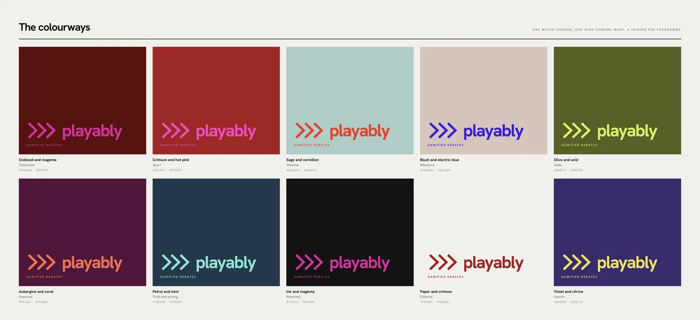
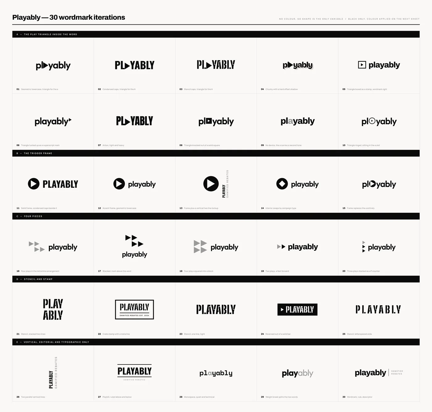
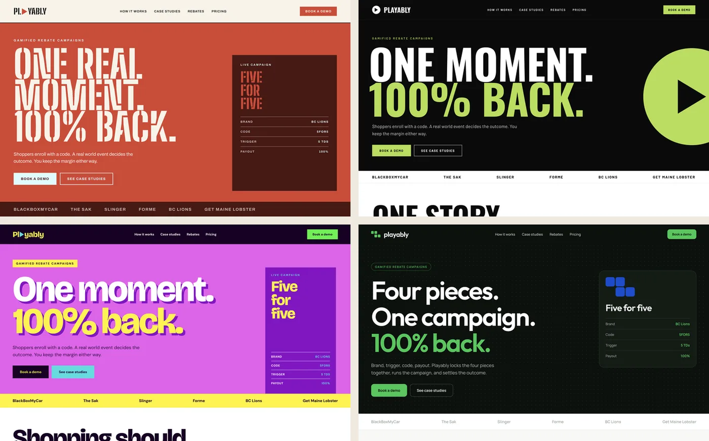
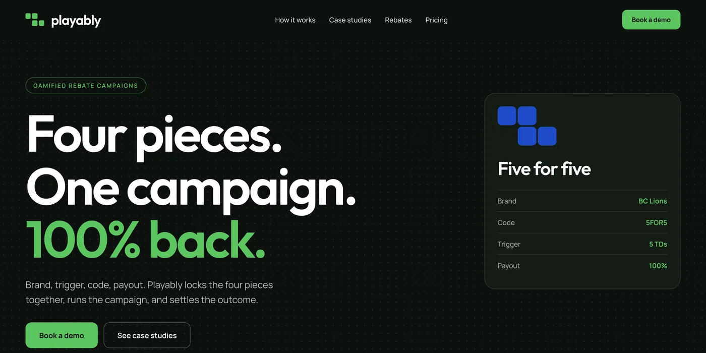
A full identity for a gamified-rebate company: thirty wordmarks, thirteen colourways, four homepages, one system. Petrol, mint, vermilion, bone.
Context
The old logo was a play button. The product is money back when a real moment happens. The brand had to earn a place at checkout and still feel like play.
My Role
Brief, wordmarks, colour, homepage directions, five review decks with the CEO, and the style guide the team builds from.
Process
How I Decided
- Shape before colour. Every mark judged in black first.
- One ground, one loud accent. So a partner brand’s colours can sit beside ours.
- Test it as a page. A brand that only works as a logo is a poster.
- Write the guide, then rebuild. Theme, decks, and campaign creative rebuilt from it in one pass.
Why It Works
- The chevron says forward and trigger at once. That is the product.
- Petrol is trust, mint is the win, vermilion is the moment. Colour has a job.
- Proven on real pages before it was declared done.
30
Wordmarks
13
Colourways
4
Homepages built as live pages